Sunday, October 14, 2007
Sunday, September 30, 2007
a moment's conversation
I see blogger has introduced a video insertion facility. Previously, if I wanted to post ''movelets'', I'd have to deconstruct the AVI file from the ixus camera, record enough snapshots and assemble a GIF animation in Paintshop Animation Workshop. I put the inferior quality down to this crude process but now I see it's really down to the camera's inability to record with precision. I really don't know why they bother! lol.
Having said that, I am fond of the concept of ''movelets'', and I'm seriously considering getting hold of a budget digital camcorder to do them justice. Also, I'll need more sophisticated editing software than MS Movie Maker provides - I'll have to get my Christmas wishlist started.
A moment resting our tired pins in Le Musée d'Orsay's main hall, I noticed the ghostly silhouettes passing the other side of the glazing behind the grand clock (the museum was once one of the main railway stations in Paris). It is, if nothing else, a good example of what defines a ''movelet''; recording movement, but not a movie.
It reminds me, in a way, of something which might belong in Jacques Tati's Playtime. I've also played around with some of the very basic effects provided and the sepia version is quite fetching, a bit Metropolis, and an edge enhancement filter gave it the look of a line drawing animation. I could play all day if I had the right tools.
All fairness to my little camera, it is showing its age and it was performing indoors with available light. And if you're wondering about the black border, that was the operator's fault. I haven't worked out how to fix the playback to show in portrait mode (yes, because I recorded it with the camera balanced on its side, like a fool!)
Sunday, August 19, 2007
Saturday, August 18, 2007
Monday, August 13, 2007
Sunday, August 12, 2007
Saturday, August 11, 2007
Friday, August 10, 2007
jack gardner's memorial
Who was Jack Gardner?
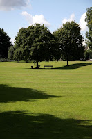
I love this little green by the side of the main road out of town. There's not much to it, just lawn and a dozen or so mature trees. The River Churn splits at its north end, the major part slipping between the green and community housing. There are three bridges, including the weir where the river divides, and a small central one reminiscent of Monet's painting. Although the town is small and surrounded by agricultural landscape, it's still good to find pockets of greenery within.
There are several ways to walk back from Town and I just happened to choose this one and was taken by the greenery and the strong early evening shadows. I took the view with the altered image below in mind, I wanted to try to strip away all superfluous detail. I was aiming for monochromatic but didn't figure on the sky, so we have a new tag; bichrome.
I'm getting into 'curve' manipulation with photoshop, it's very painterly in approach. The green channel is enhanced and both cyan and magenta reduced. This left an odd greenish cloud in the top left corner which wouldn't tone down satisfactorily so I erased it with clone brush. Sorted!
Wednesday, August 01, 2007
old age & young boy
I fear the Ixus is showing its age more and more. One digital camera year is equivalent to 12 human years. I might have to replace it - definitely with another Ixus, of course!
Pole Boy was taken as surreptitiously as I could as we walked passed, not wanting him to become self-conscious. There's a series on telly here called Coast. Last night they mentioned a seaside photographer, Peter Henry Emerson - a pioneer of the art who used a great wooden thing with a simple lens, all carried on a stout tripod, and recorded images on silvered glass plates. The contemporary expert asked to talk about him, with a twinkle in his eye, said (I paraphrase), ''photography today is largely about editing, whereas back in the day it was about recording the image''. I think it is true.
The ''depth of field'' in Pole Boy was modified by duplicating the image layer, blurring this new identical top layer and erasing that portion containing the boy - a cheap and simple trick. I wanted something to add to my Almost.... blog. Too impatient, I forgot to save the duplicate layer version before jpegging (rule no. 1!). What I could have, should have done further is mute the colour saturation levels of the background as well. (sigh)
Sunday, July 01, 2007
obstructions
The ixus is small and unobtrusive, it can be carried around without constantly feeling a need to take photos - so it's ironic that I'm more inclined to use it in town than the big eos. This is me hiding down an alley along Black Jack St. - funny how the lettering in #2 almost looks as if it was added in photoshop. They have neat writing in Black Jack St.
Isn't it a pest when people, trying to be helpful, stop short or hurry away when they think they might get in the photo? It's not like I'm shooting a movie or even taking the grinning old folks huddled together in a ''this is us in cirencester last year'' souvenir photo. Don't second guess me, I can delete the mistakes and I don't really mind making them! But thanks anyway.
Monday, June 25, 2007
photo doodle: the ash tree
More experimental doodling with Photo XI. The original shot was taken a month ago and shows one of the trees in front of our house momentarily lit by the sun peeping through dense rain clouds. It's taken quickly through the window as there wasn't much time before the sun disappeared again. I suppose it was one of those magical moments difficult to capture in a single still. Anyway, I thought I'd see what I could do to create an image which conveys something of the experience.
It really was a doodle so it won't be a reliable account but I split the image twice in RGB and CMYK, discarded all but the red, cyan and magenta. Then I tweaked the levels of each to get the best contrast of tree against sky before combining the three channels in RGB: red to red, cyan to green, and magenta to blue. Unsharp mask was used to create contrast and darken the greys. Then I copied the original colour image as a new top layer, pushed the saturation and lowered the transparency just to give the merest whiff of colour - I'll still call it B&W.
Friday, June 22, 2007
olive grove poppies
I'm enjoying getting to know the latest version of paintshop pro, Photo XI. I like the way the command history is now located on a palette which allows you to toggle and jump across previous commands rather than just linearly, though I can get a bit lost. Eventually I get down to comparing two results where I can't choose which one I prefer - too much green, too little green? I found getting satisfactory rendering of the red on green difficult: I find red is often awkward to get to look natural but if you tweak the green and blue too much the background begins to look fake. It doesn't help to know that the palette of greek greens is slightly different to those of english greens. There is a temptation to go surreal at this point but I remind myself it's not what I'm after.
As it turned out Image #2 had the minimal amount of curve adjustment and I think I prefer it the best. Sometimes you have to trust the camera.
These poppies were growing in an olive grove in front of a zakynthian house near where we were staying. Unusual as we didn't see any other poppies growing in such profusion anywhere else.
Tuesday, June 19, 2007
geometric
I'm inspired once more to do some photography and I've refurbished the Soup to render in Firefox which seems to be the only way I can post images on blogger in Vista. Also it's an opportunity to make use of the labels. The new banner was photographed last year on Zakynthos, along the little beach.
Here are some images I took with a geometric theme, in and around our apartment on Zakynthos this year. They are taken in colour mode, as always, but I thought I'd experiment with monochrome to tighten up the theme. Image #1 was achieved using RGB channel splitting, image #2 using CMYK splitting and image #3 using RGB channel mixing - each method chosen for no reason other than experimentation. Image#4 is a combination of splitting, discarding and combining channels.
Subscribe to:
Posts (Atom)